JP Morgan’s 2022 Stock Market Guide (Part 2)
A snapshot of inflation, the stock market, and the economy
Every quarter, the great financial minds at JP Morgan release a long presentation on the status of the US economy, the stock market, and global economic conditions in general.
I have already summarized other parts of it in the past, but since they have now released an updated version for Q1 2022, I figured I might go over some other different sections of this report.
Consider this a Part 2 for the article below.

Inflation is very, very high

Unlike the report released last December, this latest one puts a big emphasis on the high inflation rates we are seeing today.
As you can see from the slide above, inflation is still growing each month, regardless of the word “transitory” always being used. In fact, JP Morgan even suggests that part of it might be here to stay for the long term — inflation in shelter, restaurants, hotels, and transportation prices in particular.
This is because some sectors are faster than others at adapting to inflation: once inflation slows down, rent prices for example don’t drop vertically as they do on the way up. Restaurant or education prices do not behave like oil and stocks, and they especially don’t fall as quickly. The consequences of this are rather simple: if it takes years to get those sectors back to normal price levels, the whole CPI inflation will probably not go below 2% for a very long time.
…and your savings account isn’t keeping up
When it comes to money management, inflation is also hurting the savings of people. The slide below will show just that — it aims at answering the following question:
If you had $100k in your savings account, how much interest would it have to generate for you to keep up with the current inflation?

And the answer is pretty staggering, to say the least. Your savings account would have to generate more than $6.416 in order for you to keep up with inflation. Pretty insane if you consider the average account is currently only paying $70 for every $100k deposited — roughly 1.1% of what you would actually need to maintain your purchasing power.
The graph is also great to show how much inflation has been ramping up in comparison to the FED’s monetary policy. The amount needed to beat inflation has been doubling for three years now, but interest rates are still almost at 0%. Pretty crazy times the ones we are living.
The Yield Curve Has Inverted

Finally, the most talked-about event of the last month in the finance world: the US Treasury Yield curve has inverted. The interest rate for 10 year government bonds is now lower than that for 3, 5, and 7-year bonds.
This means investors are locking-in interest rates that are higher for the short term than they are for the long term. The logic behind this is pretty simple if you think about why the FED moves interest rates: investors fear a recession will hit the US over the next decade. If that were to happen, the FED will have to lower interest rates between 2025 and 2032, which is what the market is currently anticipating.
The reason this is so important is that the ‘yield curve inversion’ is known to be a pretty accurate recession indicator, since it’s a signal that most bond-buying financial institutions think a recession will come over the next decade.
Will it actually happen? Nobody knows, but there is a good chance since the curve inversion has successfully predicted all but one recession ever since 1955.
Analysts Are Optimistic for Corporate Profits…

Next up is a snapshot of what analysts expect for corporate profits over the coming years. Earnings Per Share in America have been steadily ramping up over the past few decades, also thanks to buybacks. It’s obviously been a bumpy road with Covid and the financial crisis, but the trend is definitely positive and there are reasons to be optimistic for the future.
But for 2022, 2023 and 2024 analysts are even more optimistic about growth than the historical trend line would suggest. The average Wall Street analyst is forecasting corporate profits to have an almost-exponential growth over the next few years — something that is actually already priced-in for most stocks in the market.
Only time will tell us if analysts are right or not — but regardless of probabilities, such a vertical growth line seems hard to believe given the current economic environment. It’s Earnings Per Share, not total profits, so buybacks also play a big part here, but it still seems hard to believe if you ask me. Especially when the yield curve is inverted and inflation is hurting American consumers.
…And You Might Still Not Profit From It
After reading what I just said above, you might be thinking “well, then I will make a lot of money if I buy stocks today”. And you would be right in theory, if it weren’t that everybody is already expecting the same thing.
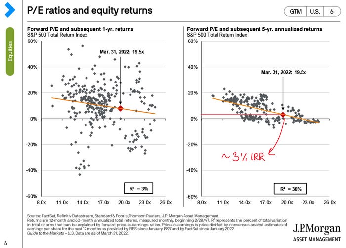
The slide above is a complicated way to say the following:
even if such exponential growth in Earnings Per Share were to come true, history and statistics show that returns will still probably be low for a while. A yearly return between 2% and 4% to be precise.
With the slide above, JP Morgan is showing how, historically speaking, buying the S&P 500 at current prices (and P/E multiples) has usually led to an average return of about 3% for the following five years.
This should come as no surprise to investors: return is the inverse function of price, and prices are currently very high. This is because analysts are already expecting earnings to grow by a lot, so they are buying stocks even if they look expensive. This inevitably leads to one of two things: low returns if those projections turn out to be true, and even worse returns if they don’t. Possibly even negative.
The possible reason for this might be the fact that we are also in a “TINA” scenario: There Is No Alternative (to investing). With savings accounts paying so little interest, to protect your money from inflation you are basically forced to buy stocks even if they are at high prices.
Is It Time To Invest Elsewhere?

As the graph above shows, US stocks have been crushing the international competition for a decade now. US indexes have returned 262% more than the Europe&Asia EAFE Index, therefore making it a better investment by a long shot.
But the picture also shows how the trend probably won’t keep on going forever. Historically, there have been a few instances where the EAFE Index has done better than the US markets, so the question has to be asked: is now a good time to buy European and Asian stocks?
The answer is a bit complicated, but Asian stocks are definitely cheaper on paper:
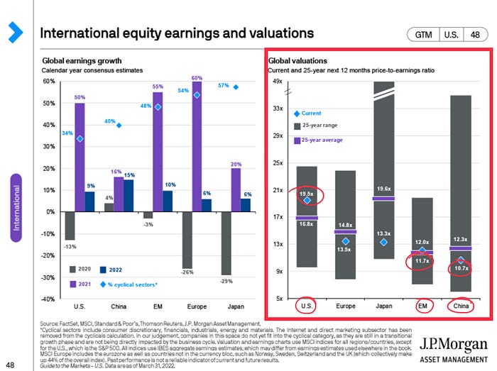
The problem is that numbers don’t always tell the whole truth. Chinese stocks could also plummet further, while the US market might keep on rising for another decade.
There are definitely some good opportunities to be found overseas, like this stock for example, but I definitely wouldn’t rush my money out of US markets just yet. After all, the situation looked pretty much the same back in 2018, but the S&P 500 kept going up regardless.
And that’s about it. You can find the full report here or by looking it up on JP Morgan Asset Management’s website.
Here is the part 1 of this review in case you want to read more (I talk about different slides, there won’t be any repetitions):
Schedule a DDIChat Session in Financial Markets and Analysis:
Apply to be a DDIChat Expert here.
Work with DDI: https://datadriveninvestor.com/collaborate
Subscribe to DDIntel here.

