What Do Big Mac Prices Tell Us About True Inflation?
A look into the price of the Big Mac over the years and the insight it gives us into inflation
Inflation has become a hot topic recently. And rightly so.
After decades of a ‘low’ inflationary environment, headline numbers are picking up.
The latest print on the US Consumer Price Index (CPI) was 6.2%. Consensus is gathering that inflation is not “transitory” and is in fact structural.
Yet, the question I wanted to explore is this. Has inflation actually been higher than CPI would suggest? There are many who think this is the case.
To inform this debate, I looked at the historic prices of the Big Mac over time and compared them to CPI.
Why the Big Mac and what is the Big Mac Index?
So, why the Big Mac?
Well in part because it is a stable product that doesn’t change over time. It has wide consumption across the population (and globe). Its input costs are also broad. It takes many factors like meat, dairy, vegetables, labour and property to produce a Big Mac.
But the primary reason I chose the Big Mac is I was able to get the historic prices from the Economist’s Big Mac Index.
If you have not heard of it before, the Big Mac Index is a concept invented by The Economist magazine back in 1986.
They created the index as a light-hearted way of comparing purchasing power parity between countries. In other words, how much “bang for your buck” do you get between countries.
The idea is that over time exchange rates should normalise so that things cost the same amount. So, at any point, by comparing the actual prices of the Big Mac we can determine if a currency is under or over-valued relative to another.
If you want to know more about it, The Economist has a great site and you can access their data sets.
The reason the Big Mac Index is useful for this article is it gives me the historic prices for the Big Mac since 1986. It thus allows me to compare the actual prices to those inferred with the historic CPI rate.
How has the price of the Big Mac changed over time?
In the chart below, I’ve plotted the historic price of the Big Mac in the United States (US) over time. This is labelled “Actual Price” and represented by the dark blue line. The price of a Big Mac has risen from $1.60 in 1986 to $5.65 today. An increase of 253%.
I have also plotted another line in lighter blue called “CPI Calculated Price”. This is the predicted price of the Big Mac when I apply the rate of US CPI to the original price starting from 1986.

The difference is quite stark.
CPI would predict a Big Mac price today of $3.96, which is ‘only’ a 147% increase over the last 35 years. But the actual cost of a Big Mac today is 43% higher than CPI would predict.
Put another way, on an inflation-adjusted basis, your money today only buys you 70% of a Big Mac compared to 1986.
We can also reverse engineer the implied inflation rate from the Big Mac. Doing so suggests that per annum inflation is 1% higher than stated by the CPI.
Note you can see that in the current year, 2021, the price is actually lower than last year. It will be interesting to see what happen to this as current higher levels of inflation catch up…
For reference, I’ve also plotted the same data for the United Kingdom (UK). This series is from 1988 to 2020.
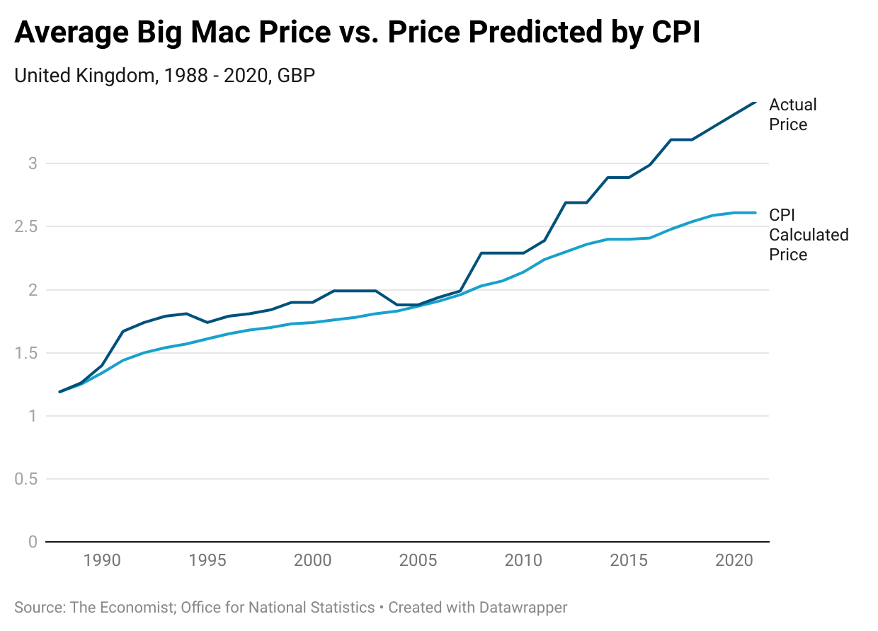
You can see this chart tells us a similar story. In this case, the difference is a little less severe i.e. 34%. But the overall conclusions remain the same.
So what does it tell us?
Is the Big Mac representative of prices across the economy?
Well, no. We all consume many more things other than Big Macs. Yet, it points to questions about the validity of the CPI. And it does support schools of thought who assert inflation runs hotter than CPI. Or in other words that CPI understates true inflation.
You could be forgiven for thinking that Central Banks and governments want to under-report inflation. Particularly in the current environment of excessive money printing.
There are many benefits to the government of reporting lower inflation. For example, it allows them to erode the value of their (very large and escalating) debts. This is at the same time as continuing to apply doveish monetary policy to ‘stimulate’ the economy.
It also keeps inflation-linked public spending in check. For example public sector salaries, unemployment benefits and state pensions. These all go up with higher CPI. So a lower reported CPI means lower spending on these (and other) items.
Some criticisms of CPI
CPI is not without its critics. The way we calculate CPI has also changed a fair bit over time. The US Bureau of Labor Statistics (BLS) currently handles CPI calculations.
Some common criticisms of CPI include:
- Choice of the basket of goods. The BLS calculates the CPI based on an assumed “basket of goods”. Of course, what one family consumes will be different to another. As such, there is always scope for this to misrepresent. Also, the government changes the basket over time as spending habits change. This means the index is prone to manipulation (or at least a high degree of subjectivity) by the chosen basket.
- The “substitution effect”. This is a concept from economics. It suggests that as some products become more expensive people replace them with cheaper alternatives. For example, if the price of apples goes up, I may buy pears instead. There are different methods the BLS uses to account for substitution in calculations. But again, this is an area prone to bias in the calculations.
- Changes to quality. The BLS also makes adjustments to items within the basket based on perceived quality. This is a technique known as “hedonic adjustment”. As an example, a car model may increase in price over time. But, because cars today are more functional than say 20 years ago, a reduction in the price used is made to factor this. However, you are still paying more for the car. This practice you can see can put downward pressure on the CPI value.
This article is not a full critique of the CPI. Its purpose is to give some examples to show the difficulty and bias in the calculations. I will probably write a future article to explore this in more detail.
In conclusion…
I hope you found this an interesting take on inflation, CPI and Big Mac prices!
Remember, I’m not suggesting Big Mac prices are representative of economy-wide inflation. But do I hope it has given you some food for thought.
To summarise the key points:
- The Economist’s Big Mac Index allow us to track historic prices for Big Macs.
- Between 1986 and 2021, the US Big Mac price rose from $1.60 to $5.65. An increase of 253%.
- The CPI index predicts a smaller price increase of $1.60 to $3.96.
- Big Mac prices suggest inflation has risen on average 1% higher than recorded CPI per annum.
- CPI as a measure faces many criticisms. These include the chosen basket of goods, the substitution effect, and quality adjustments.
If you enjoy reading articles like this why not sign up and become a Medium member? It will give you unlimited access to all stories on Medium. If you use my link, I’ll earn a small commission.
I write other articles about trading, investing, and economics. You can subscribe here to receive an email every time I publish a new article.
This article is for informational purposes only. It should not be considered Financial or Legal Advice. Not all information will be accurate. Consult a financial professional before making any major financial decisions.

